The right tile floor design ideas can transform a blank slab into the defining feature of a room. Yet with thousands of patterns, materials, finishes, and sizes available, the selection process can feel genuinely overwhelming. This guide cuts through the noise. You’ll find a practical framework for evaluating options, a curated look at the most inspiring patterns available right now, and honest advice on how to balance aesthetics with safety and longevity. Whether you’re updating a Denver bathroom or redesigning a commercial lobby, this is where smart tile decisions start.
Table of Contents
- Key Takeaways
- 1. How to evaluate tile floor design ideas: materials, patterns, and safety
- 2. Popular tile floor pattern ideas that actually transform rooms
- 3. Comparing tile materials and finishes for style and durability
- 4. How tile size and layout choices affect space and safety
- 5. Mixing and matching tile designs for unique, harmonious spaces
- My honest take after years of tile installations
- Ready to bring your tile vision to life in Denver?
- FAQ
Key Takeaways
| Point | Details |
|---|---|
| Safety ratings matter | Choose tiles with a DCOF of 0.42 or higher for wet residential areas to meet ANSI standards. |
| Pattern shapes perception | Diagonal and geometric layouts alter how spacious or dynamic a room feels without changing its actual size. |
| Material drives durability | Porcelain outperforms ceramic in high-traffic and wet zones due to its lower water absorption rate. |
| Size affects traction | Small mosaic tiles increase grout density in wet areas, which significantly improves slip resistance. |
| Bold patterns need balance | Pair statement floors with subdued walls and furniture to create intentional, visually harmonious spaces. |
1. How to evaluate tile floor design ideas: materials, patterns, and safety
Before you fall in love with a pattern, you need a framework for evaluating your options. Tile design, known in the industry as ceramic tile specification, involves balancing visual appeal with measurable performance criteria. Getting this order right saves you from expensive regrets.
Material type is your first decision. Ceramic and porcelain tiles look similar on the surface but perform very differently. Porcelain is denser and more durable, which matters in kitchens, bathrooms, and entryways.
Safety ratings are non-negotiable in wet spaces. ANSI A137.1 requires a minimum Dynamic Coefficient of Friction (DCOF) of 0.42 for wet residential floors, with shower floors needing around 0.60. R-ratings work on a similar scale for commercial spaces. Keep in mind that these ratings are comparative guides, not absolute guarantees of safety.
Here is what to evaluate before choosing any tile:
- Slip resistance: DCOF and R-ratings tell you how a tile performs wet. Matte and textured finishes score higher than polished ones.
- Tile size: Larger formats look sleek but have fewer grout lines, which actually reduces traction on wet floors. Small 2×2 inch mosaics increase grout density, giving wet-zone floors far better grip.
- Surface finish: Polished tiles reflect light beautifully but are slippery when wet. Honed and matte finishes provide more friction and are easier to maintain.
- Room traffic: High-traffic rooms need tiles rated PEI 3 or higher for wear resistance.
Pro Tip: When choosing between a matte and polished finish, consider that matte tiles show fewer water spots and footprints in bathrooms, which means less daily cleaning even if slip resistance is your primary concern.
Tile drenching, a design trend where tile covers floors, walls, and even ceilings in one continuous material, is gaining serious momentum in 2026. It creates an immersive, spa-like aesthetic that works particularly well in bathrooms and entryways.
2. Popular tile floor pattern ideas that actually transform rooms
Pattern is where tile design gets exciting. The same 12×12 ceramic tile looks entirely different in a straight grid versus a diagonal layout. Here are the most effective patterns and what each one does to a space.
- Straight-set grid: The most common layout. Tiles are set square to the walls in clean rows. It is orderly, timeless, and the easiest to install. Great for large open areas where you want the tile color or texture to do the talking.
- Diagonal or diamond layout: A 45-degree rotation of the grid draws the eye across the room diagonally, making spaces feel larger and more dynamic. It is one of the smartest choices for smaller rooms.
- Stacked rectangular: A strong trend in 2026, this layout sets rectangular tiles in straight horizontal or vertical rows without offset. The result is clean and minimal, and it works in both small powder rooms and large open-plan living areas.
- Checkerboard: Two alternating colors in a grid pattern. Bold, graphic, and undeniably classic. It reads as retro in small doses and genuinely striking at scale.
- Bold mosaic: Intricate mosaic designs treat the floor as a focal point. Handmade borders, floral motifs, and checkerboard variations are among the most popular floor tile categories influencing residential design right now.
- Geometric ceramic patterns: Fireclay Tile recently launched six ceramic floor patterns, including Lattice, Mission, Gramercy, Portico, Atrium, and Hacienda. Each comes with over 50 slip-resistant glaze options, which proves that safety and beauty are not mutually exclusive.
- Basketweave and lacework: These intricate small-format patterns bring artisan craftsmanship to a floor. They work best in bathrooms, mudrooms, and accent entryways.
Pro Tip: Use a diagonal layout in a narrow hallway. Straight grids tend to emphasize the length, while a 45-degree rotation visually widens the space.
Here is a quick comparison of patterns by room type:
| Pattern | Best room | Visual effect |
|---|---|---|
| Straight-set grid | Living room, kitchen | Clean, orderly, timeless |
| Diagonal/diamond | Small rooms, hallways | Makes space feel larger |
| Stacked rectangular | Any room | Modern, minimal |
| Checkerboard | Kitchen, bathroom | Bold, graphic statement |
| Geometric/mosaic | Bathroom, entryway | Artistic focal point |
| Basketweave | Bathroom, mudroom | Intricate, artisan character |
3. Comparing tile materials and finishes for style and durability
Not all tile is created equal, and the differences go well beyond price. Choosing the wrong material for the wrong room is one of the most common and costly mistakes in flooring.
Porcelain tiles absorb less than 0.5% of water and typically carry a PEI rating of 3 to 5, making them the right choice for bathrooms, kitchens, laundry rooms, and outdoor-adjacent spaces. They cost between $3 and $15 per square foot. Ceramic tiles absorb between 0.5% and 3% of water and cost $1 to $8 per square foot. They work perfectly well in low-moisture, moderate-traffic areas like bedrooms and living rooms.
Finish type is where most homeowners underestimate the decision:
- Polished: High-gloss, reflective surface. Visually stunning, but genuinely slippery when wet and requires frequent cleaning to hide smudges.
- Honed: Smooth but matte. Less reflective than polished, easier to maintain, and safer in wet areas.
- Matte: Flat finish with the best slip resistance of the three. It hides dirt well and works beautifully in high-traffic areas.
- Textured: Deliberately rough surface that maximizes grip. Best for outdoor patios, pool surrounds, and shower floors.
For the Denver market specifically, where homes see everything from muddy boots to snowmelt tracked across entryways, porcelain with a matte or honed finish is the most practical long-term choice. You can explore the full range of current flooring options for 2026 to see how tile compares to other materials for your specific renovation.
4. How tile size and layout choices affect space and safety
Tile sizing is a design decision that most homeowners treat as an afterthought. It shouldn’t be. Size determines how a room feels, how safe a wet floor is, and how complex your installation will be.
Large format tiles, think 24×48 or 32×32 inches, create a contemporary, expansive feel by reducing the number of grout lines visible across a floor. Fewer lines means a cleaner visual flow, which is why they dominate modern kitchen and living room design. The trade-off is that large tiles require a very flat subfloor and more precise installation.
Small format tiles, especially 2×2 inch mosaics, do something large tiles cannot: they follow curves and contours easily, and their dense grout network acts like micro-treads in wet zones, significantly improving grip in showers and around pools.
Here is how to match size to situation:
- Large format (18 inches and up): Open living areas, master bathrooms, commercial lobbies
- Medium format (12×12 to 18×18): Kitchens, dining rooms, standard bathrooms
- Small format and mosaics (under 6 inches): Shower floors, backsplashes, accent borders
Complex patterns like herringbone and chevron are visually impressive, but intricate tile layouts require significantly more labor and generate higher material waste than straight grids. Budget for 10% to 15% more material when using angled or non-standard layouts.
Pro Tip: Match tile size to room square footage. A 4×4 foot bathroom tiled in 24-inch format will feel awkward and cramped. As a general rule, the largest tile dimension should not exceed half the shortest wall in a small room.
For a deeper look at how layout decisions affect your renovation budget and timeline, the Denver homeowner’s tile guide at Leonardosflooringcorp covers installation specifics in detail.
5. Mixing and matching tile designs for unique, harmonious spaces
Creative tile combinations are where personal style comes through, but this is also where most DIY design efforts go wrong. The goal is a floor that feels intentional, not busy.
The single most reliable rule from working designers: bold geometric or floral floor patterns must be paired with subdued wall and furniture surfaces. When floors are the star, walls and furnishings should be supporting players. Violating this principle is why some beautiful tile choices end up looking chaotic in real rooms.
Practical techniques for successful mixing:
- Tile drenching with a single tone: Use the same tile or closely related tile across floor and lower wall sections. This creates cohesion rather than contrast.
- Border tiles as transitions: Use a narrow band of a contrasting tile to separate a patterned floor from a plain surround. This frames the pattern and makes it feel deliberate.
- Two-material floors: Pair a stone-look porcelain in the main field with a geometric ceramic accent in a foyer or niche. Keep the color palette consistent even when the patterns differ.
- Consistent grout color: One of the most overlooked tools in tile design. Dark grout on light tile emphasizes the pattern grid. Light grout on light tile creates a seamless, monolithic effect.
Checking out 2026 design trends can give you a concrete sense of which combinations are leading in residential interiors right now. The consistent thread is restraint: one bold choice per room, supported by quieter selections everywhere else.
My honest take after years of tile installations
I have walked through hundreds of tile projects with Denver homeowners and designers, and the pattern I see most often is this: people spend weeks choosing the right tile and then give the installation barely a second thought.
That is backwards. The most stunning tile I have ever seen was ruined by an installer who did not account for the room’s actual layout before cutting. The starting point, the center line, the direction of the pattern relative to natural light. These decisions are invisible when they go right and disastrous when they go wrong.
My other strong opinion: stop chasing trends as your primary filter. Stacked rectangular layouts and bold mosaics look great in 2026, and they will likely look dated in 2036. What holds up is quality material, a thoughtful pattern that suits the room’s proportions, and a finish that matches how the space is actually used. A matte porcelain in a classic large-format grid will outlast most trend-forward choices on both style and durability.
The homeowners whose floors I am most proud of are the ones who told me what they wanted the room to feel like, not just what tile they had seen on Pinterest. Start with the feeling. The right tile follows from there.
— Jim
Ready to bring your tile vision to life in Denver?
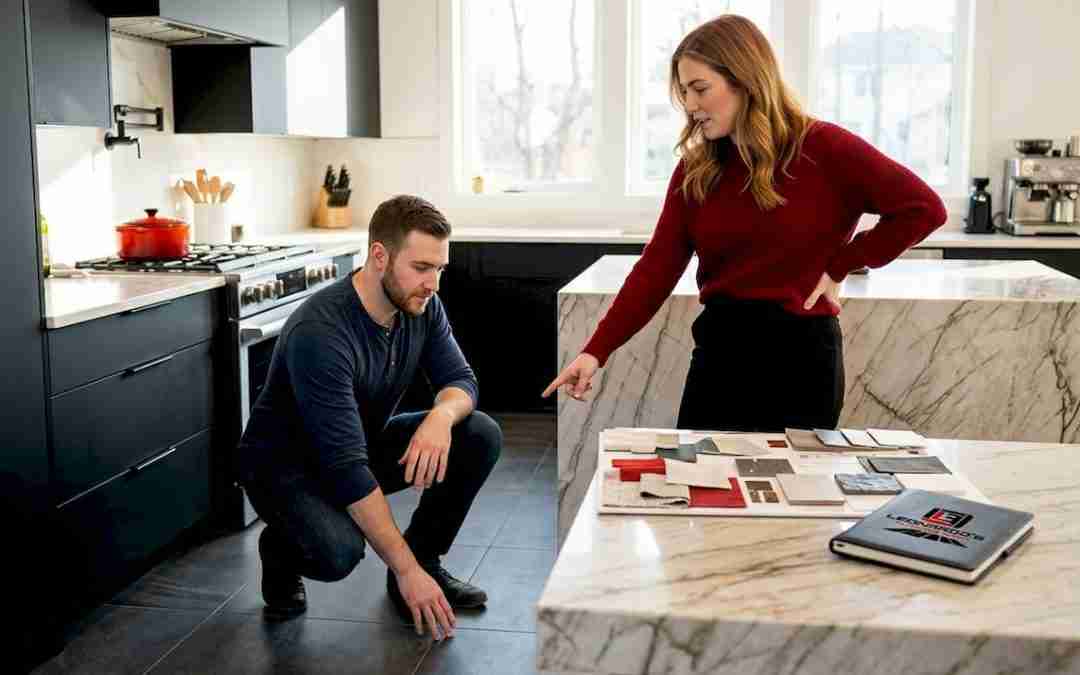
If you have spent time working through these design choices and you are ready to move from planning to installation, Leonardosflooringcorp is here to help. As Home Depot Contractors serving the greater Denver area for over 10 years, we handle professional tile installation for both residential and commercial projects, from single bathroom refreshes to full home renovations.
We do not do cookie-cutter work. Every project starts with a conversation about your space, your budget, and your timeline. Whether you are installing a bold geometric floor in a downtown Denver condo or a durable matte porcelain in a high-traffic commercial lobby, our team brings the layout precision and craftsmanship the work demands. We also cover the full range of flooring installation services, so if tile is just one part of your renovation, we can handle the rest. Reach out today for a consultation and estimate.
FAQ
What is the best tile pattern for a small bathroom?
A diagonal or diamond layout is the most effective choice for small bathrooms. The 45-degree rotation draws the eye across the room, making the space feel larger and more open.
How do I choose between ceramic and porcelain tile?
Use porcelain in wet or high-traffic areas since it absorbs less than 0.5% water and carries a higher PEI wear rating. Ceramic is a cost-effective choice for low-moisture, moderate-traffic rooms.
What slip resistance rating do I need for shower floors?
ANSI A137.1 recommends a minimum DCOF of 0.42 for wet residential floors and approximately 0.60 for shower floors specifically. Textured finishes and small mosaic tiles with dense grout lines provide the most reliable traction.
Do large format tiles make a room look bigger?
Yes. Large format tiles, such as 24×48 or 32×32 inches, reduce visible grout lines and create a clean, continuous visual flow that makes floors and rooms feel more expansive.
How much extra tile should I order for complex patterns?
Budget for 10% to 15% extra material when using angled layouts like herringbone or chevron. These patterns require more cuts and generate higher waste than straight grid installations.